Have you ever taken a look at the home page of your favorite websites? What do you notice when you look at them? What do you notice when you compare them? All the main elements found on a home page are located in the same or similar spots from website to website. Interestingly, this is not just a coincidence. The design of a website’s home page is critical to the success of the website, and there needs to be a particular flow set up so you can guide your visitors where you want them. This carefully crafted and targeted experience should work best for the specific clients you want to attract. The design of a home page is critical to the success of the website. Add these 9 elements to carefully craft your home page for maximum results.
It’s extremely important to get the website visitor experience on your site right. Putting the logo where someone expects to see it, easy-to-find contact information, and site navigation; all of these things need to be placed correctly within the structure of the website.
Every really great website that converts includes all of these items and, more importantly, includes them in the right places. Here’s a list of the nine most common elements needed in a home page design. We’ll also discuss the “why,” “where,” and “how” of getting the design right. And here we go!
Table of Contents
- Logo and Branding Elements
- Hero Section
- Call to Action
- Clear Navigation
- Thoughtfully Chosen Typography
- Cohesive Color Scheme
- Appropriate Images
- Social Proof
- Contact Information
- Wrapping it up
#1 – Logo and branding elements
Almost every website you visit has a logo. You probably recognize many of them through their logos alone, which tells you something about the power of good logo design and branding. The most effective websites place their logo on the upper left side of the website because that’s where the site visitor’s eyes usually go upon first glance of your website. Another commonly used location for the logo is also the top center either in the middle of your navigation or just above it, although that location is not as common as putting it in the upper left. When in doubt, go with the most common location for this.
Overall and as a rule: when it comes to placing your logo, it should be easy to find, and big enough so that visitors can actually see what it says. Don’t hesitate to look at your logo placement in various browsers, or on your phone. That can make a big difference in how your logo looks and works.
If you don’t already have a logo, you can contact us to find out more about our logo design services. Other branding elements that we’ll discuss further in this article are typography and color scheme. And a huge thing for branding is your content’s message and tone, which is conveyed through your logo, colors, typography, and content. We’re not going to discuss content today, as that’s a huge subject that I’ll keep for another day.
#2 – Hero section
A “hero” section is usually the first thing you see below the header/navigation area. A Hero section should include a large image that fills the entire space/section with important text on top that should convey your main purpose for the website and what you do, and what you want your website visitors to do (the last thing is also called a “Call to Action” or CTA and we’ll talk about that in another section).
How do you know if you have a good “hero” section set up? Does it have useful information? Does it include your call to action? Are you using it as more than just “something pretty” for your site visitors to look at?

#3 – A clear and compelling “Call to Action” (CTA)
A call to action (CTA) is any element on your website that asks people to do something specific, and it’s one of the most important things you can put on your website. A good CTA should be clear and compelling. After all, the ultimate goal of any website is to get the site visitor to DO something specific. That something may be to purchase something from you, give you their email, contact you for more information, sign up for your newsletter, donate to your cause… the list can go on and on.
Your main CTA should be placed inside your hero section; in fact, I recommend it as that’s one of the first things a visitor sees when they get to your website. CTAs can also be placed throughout your website, especially if you make sure your call to action stands out over the rest of your website.
A typical call to action – one people see frequently on a website – is a brightly colored button in a contrasting color. The button should include compelling verbiage which accents or highlights your CTA message in a clear and compelling manner, e.g.:
Wherever you put your CTA, it should be well-designed and carefully placed to be an effective means of prompting the desired response.

#4 – Clear navigation
Visitors need a navigation menu to move around your site, even if your website is a one-page design. This menu should be included at the top of your page in the header near the logo.
Website navigation should be very readable and easy to use. The navigation menu can also be another place to put a call to action (CTA), but be careful to keep your primary top menu to a minimum number of items. I typically like to keep it to five or six at most, this way the site visitor isn’t overwhelmed with so many options they don’t know what to click, and it also makes the design of the header on a website a lot easier.
I recommend you put the main navigation at the top (with the five or six main website pages or items) and then put a larger set of navigation at the bottom in the footer.
#5 – Thoughtfully Chosen Typography
Think your typeface doesn’t matter that much? Think again! Your choice of typeface can make or break your website and is more important than you know. The choice of the right typefaces can make your website easier to read and can also be used as a visual design element. While certainly, font choices are a matter of personal style, it’s always best to stick to classically styled fonts that help with accessibility and to stick to one or two families that complement each other. On my site, I use one typeface for all my headings, and another for the main body text but these two complement each other nicely and don’t clash. These two typeface families have multiple weights that give me a lot of flexibility in my design.
Typeface size also matters. Don’t set all your headings so huge that you end up with one word per line. And don’t set your main paragraph size so small that it’s not readable or so large that it also takes up a whole monitor just for one sentence. There are a lot of really good articles about typography for websites. When you get to this point, it’s a good idea to read some of the recommendations.
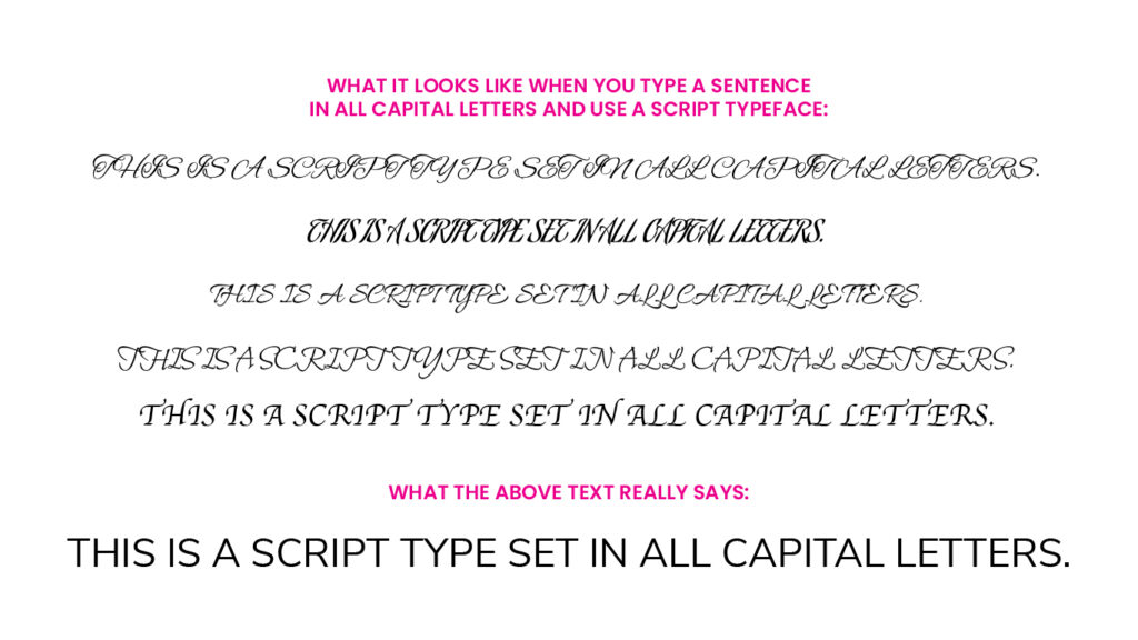
Using a script, cursive, or handwriting font can be a nice accent on a website but when using a script, cursive, or handwriting typeface, you should use them sparingly. NEVER NEVER NEVER use them on words or sentences that have the entire word or sentence capitalized. Look at this graphic to see what it looks like when you put a typeface like this in all capital letters:
Remember, it’s always a good idea to thoughtfully and carefully choose your website’s typefaces. If you need assistance and don’t know much about typography or choosing a typeface, please contact me for a free consultation.

#6 – Cohesive color scheme
One big aspect of a website’s design is the color scheme used. Color isn’t only about style and design, but also about psychology, about direction (it can help guide the eye through the page) and can be influential for what people’s perception is about your business or brand.
We recommend you choose a couple of main colors that work well together and use them throughout your website. Two main colors and a complementary color for your CTAs are a good way to go. You’ll notice on my website my main colors are a deep, almost black charcoal, and a nice sky blue, with my CTA color being a vivid magenta (see them here: e design studio, LLC’s colors). You can also use a variety of tints and shades of these colors once you have chosen your main color palette.
A few good color tools to check out:
#7 – Appropriate Images
Images make up a big part of most website designs, and that includes your home page. Imagery is way more important than most of us may think. Consider websites you’ve visited that didn’t have a lot of photography but were full of blocks of text. Most of us don’t read that text because it’s just too much. Images chosen carefully will help break up the blocks of text and keep the viewer interested in what’s on the page.
Always carefully consider what your images convey, and what your brand stands for. Avoid stock images unless they really convey your business or style, and make sure your images are optimized, especially if you are using them as backgrounds for sections on your home page (such as the hero section). This will keep your website loading quickly.

#8 – Social Proof
So what is social proof? Social proof defined, is “a psychological phenomenon where people conform to the actions of others under the assumption that those actions are reflective of the correct behavior.” Marketers use social proof to optimize conversion as it can ease the minds of worried customers. How do they know who you are? What makes them want to trust you? Social proof can inspire trust for your website visitors.
How to add social proof:
A really great way to offer social proof is to provide testimonials and reviews. I recommend you only use a few of the very best on your home page – three to five maximum – otherwise your site visitors will think you are trying too hard to sell to them. If you still want to use the rest of your reviews on your website, you can always put them on another page on the website.

#9 – Contact Information
For some, the thought that I had to include this in the list might seem like a “duh!” but I have actually visited websites where the contact information was extremely hard to find, or non-existent. Contact information is a must for your home page. Since you want easy access to this everywhere, I recommend you put this in the footer, which typically is found on every page of your website. Include your main contact information like email, phone number, address, and map (you only need the address and map if you have a physical location where you meet with customers).

Let’s wrap this up with an analogy!
Your website is a bit like a book that has a cover, title page, table of contents, then chapters, etc. You know exactly how to find what you’re looking for in a book, and it’s much the same in good website design, which is WHY so many websites have such a similar layout. When people visit your home page, they should know exactly what the purpose of the site is, how to get around within the website, how you can help them, and, most importantly, a compelling reason for them to reach out to you to request what you’re offering.
Thanks for reading!
