If you’re a business person, you want a professional logo.
Everyone wants that. Ironically, one of the biggest search terms is “Cheap Logo Design”. Why is that? Is it evidence that people don’t understand the difference between a cheap logo or a professionally designed logo? Is it based on a company needing to find an inexpensive logo? Is it a lack of understanding of the value a professional logo will give to a business?
Most businesses need a GOOD logo.
You own a business. Or you market for a business. Either way, you are out there promoting that business. After a person has met you, what’s the very first thing they see? Your Logo. Your first impression via the first thing they see (your logo) will make up their about you and your company. You want that first impression to be a positive one. And know this: No matter how much time you spend on saying just the right thing, on finding the right words to represent your company and attract new customers – it’s your brand identity that will resonate with people the most. This is why it’s so important to have the right logo design, whether your company is just starting up or has been around for years.
Your logo is your opportunity to make a solid first impression. It should help show your quality service or product, and should express your purpose visually.
Your logo is your chance to make that solid first impression.
So get a good one designed for you; make it count!
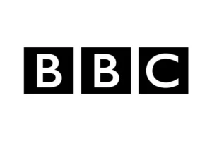
Your logo is more than just a bunch of shapes, colors, or letters. Your logo and brand is the company calling card. It has power; the capability of breaching cultural and language barriers. Consider the logos and branding for companies like McDonald’s or Coca Cola. They are everywhere, yet people recognize them even if it’s just the logomark (the logo / shape without words). Consider the BBC logo redesign:
Their main logo is now this (there are several iterations, but this is the one we see most) – and its’ considered one of the most successful redesigns in the history of design:

The designers went with a very minimalistic look based on squares. Shapes can convey various meanings, but most people associate squares and rectangles with strength, security, and reliability. The logo’s solidness showcases clearly defined contours associated with unambiguity and reliability. So this logo meets its mark bringing with it a feeling of trust and authority. BBC paid $1,800,000 for this logo redesign. . . and for this company, with its longevity and success both now and projected into the future, the redesign was considered a success.
Why did I include this? Because your logo needs to convey a lot of things about you and your company. It should communicate ownership. It should show value (and what you can provide for your clients and customers). It should also show your values – what things are important to you as a business owner, and, more importantly, what your values behind your company will do for your customer or client.
So Tracy, that’s lovely, but I’m not a big company like the BBC. What do I need to know when planning the logo for my small business?
That’s a fantastic question. There are several things we need to remember when designing a logo for our company.
Steps for expert logo design that get results:
1 – Understand your business
You (and your designer) need to understand your business before you start on any logo designs. You need a company name. It can also help if you have an abbreviation of that name. In my case, “ë design studio” becomes just “ë”. You should also consider your tagline and if you don’t have one, you should create one. One of my webcare clients has a tagline for her logo and it reads “Music that touches the heartstrings”. A few questions you can ask yourself here are:
- What symbols or shapes could help convey what your business does?
- Are there any icons out there that instantly convey your business type?
- What sort of personality should your logo convey to match your business? (That same client I mentioned above – she is a pianist and her branding conveys the elegance she brings to all her performances).
- Does your logo showcase how you set yourself apart from your competitors? How can you do that with your logo?
- Do you know the difference between colors that you like versus colors that are psychologically proper for your business type and what you’d like to convey your business as to your potential clients?
 2 – Understand that nobody really cares about your logo.
What people really care about is the experience with your products or services and what your logo, your company, represents; what it champions. What? If that’s the case, why do I need one? Why should I have a professional design a logo for me if nobody really cares about it? Because if done right, a good logo design does more than look professional – it signifies what the company exemplifies. Think about it. If your logo can convey what you do, why, and how what you do can help your customers, it’s a win and you’ve promoted yourself already without saying a word.
3 – Concept creation and evaluation (i.e. effective reviews of the logo design(s))
When your designer is at this stage, there should have been enough conversations between you, so that the designer knows what your business should convey through your logo. The designer, if good, will do some research and a lot of sketching is also done at this stage. Anything can inspire here as the designer should be exploring lots of avenues. Once a bunch of concepts are sketched, then they are brought into an editing program. In my case I typically use Adobe Illustrator. We end up with three to five sets of concepts pulled from the sketches, fine-tuned in Illustrator. I like to schedule a time to review the concepts either in Zoom or in person. As a business owner, it’s your job to look carefully at everything here. Spelling, spacing, colors, etc. Suggestions for adjustments (“can we try this….”), are all helpful. If you can verbalize your thoughts here, it’s helpful to the designer. Don’t just say, “I am not sure I like it,” but say why. The more feedback the designer gets, the better the final designs will be.
From start to finish, there’s a lot to consider when creating your logo. It has to convey everything that your company embodies. How do we do this? By using three things: fabulous typography, colors that evoke your brand, and a visual element that strongly represents your company. The final design should be versatile, creative, and effective.
A few other elements to consider along these lines:
- You should choose typography that fits your company values and style (people associate the way a word looks with what it actually says to determine how they feel) – if you don’t know what you like, your designer can help with this.
- You should also choose your color theme wisely (color can improve your brand recognition by as much as 80%). There are a lot of good articles about color psychology out there. If a designer is any good, they’ll know what these are and how to properly incorporate colors in your logo based on what you want your company logo to invoke, color-wise.
- You should possibly include a simple iconic element as well, however, this is optional, and can be left out if the typography and colors are strong enough. A good example of NOT using an icon is my own logo, although you will see that I do use the first letter ë as a “logomark”:
e design studio’s main logo:

e design studio’s logomark:
![]()
3 – Delivery of final logo
Here is where the designer finalizes everything, ensuring that quality is key. The final documents the client receives are a wide variety of file types and output sizes for various uses. If the designer is any good, they’ll also provide a sheet that lists what the client has received, and the various uses of all the files. Also included in that spec sheet are font names and color formats with instructions for how to use everything properly.
Conclusion
Simple logos are the best logos. They convey a clear message. Simplicity is what is remembered where logo design is concerned, so it’s a good idea to keep that in mind when you and your designer are working on your logo.
